Chart Settings
Display Options
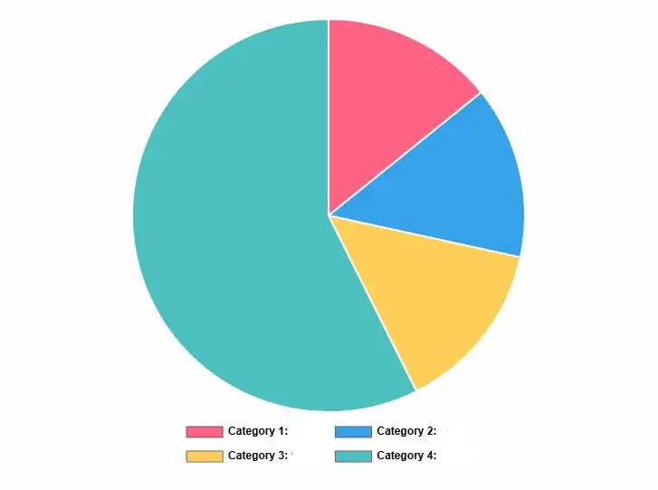
Sectors (3)
Chart Preview
Enter sector values to generate chart
Add at least 2 sectors with valid values
What is a Pie Chart?
A pie chart is a circular graph that shows data as slices of a whole. Each slice represents a category's proportion compared to the total. It's used by students, researchers, business analysts, and teachers to display survey results, budget breakdowns, market share, and demographic data.
Pie charts work best when you have 3-7 categories that add up to 100%. They let viewers quickly see which categories are largest or smallest. You'll see them in reports, presentations, dashboards, and academic papers.
When to Use Pie Charts
| Use Case | Best For | Example |
|---|---|---|
| Budget Breakdown | 3-6 expense categories | Housing 40%, Food 25%, Transport 20% |
| Market Share | Company percentages | Apple 28%, Samsung 22%, Others 50% |
| Survey Results | Multiple-choice responses | Satisfied 60%, Neutral 25%, Unsatisfied 15% |
| Demographics | Population distribution | Age groups, education levels |
| Time Allocation | Daily schedules | Work 8h, Sleep 8h, Leisure 8h |
The pie chart was invented by William Playfair in 1801. He wanted a visual way to show data that anyone could understand at a glance. Today, pie charts are everywhere because they make complex numbers simple. They help people see patterns without reading through tables.
However, pie charts aren't perfect for everything. They work poorly with too many categories (more than 7). They're also bad for comparing similar values since humans struggle to judge slice sizes accurately. For trends over time or precise comparisons, bar charts or line graphs work better.
How to Use the Pie Chart Calculator
Creating your pie chart with our pie chart calculator is simple. You'll have your visual ready in under a minute. Here's how to use it:
Add Your Chart Title
Type a descriptive title that explains what your data shows. Make it specific so viewers understand the context. For example, "2025 Marketing Budget" is better than "Budget."
Enter Category Labels and Values
For each sector, add a label (like "Rent" or "Product A") and its numeric value. If you need to calculate percentages from raw data first, our percentage calculator handles those conversions. The pie chart calculator automatically converts them to the right proportions. Values must be greater than zero.
Customize Colors and Settings
Click the color box next to each category to pick custom colors. Use the settings panel to switch between pie and donut charts, sort sectors by size, or toggle the legend on and off.
View Results Instantly
Your chart updates in real-time as you type. You'll see the visual on the right, plus a data table showing each category's value and percentage. No calculate button needed.
Pro Tips for Accurate Pie Chart Calculations
- ✓Keep it simple: Use 3-7 categories max. More than that makes your chart hard to read. Combine small categories into "Other" if needed.
- ✓Use consistent units: Don't mix dollars and percentages. Pick one type and stick with it across all sectors.
- ✓Check your total: Make sure your values add up correctly. The calculator shows the total at the bottom.
- ✓Sort for clarity: Arrange sectors from largest to smallest. This makes patterns easier to spot.
- ✓Use explode wisely: Only emphasize one or two sectors. Too many exploded slices looks messy.
Common mistakes include entering zero values (calculator rejects them), using too many decimal places (round to 2 decimals), and forgetting to label categories clearly. Fix validation errors before exporting your chart.
Understanding Pie Chart Percentages
Every pie chart shows proportions as percentages of a whole. The math is straightforward. Here's how it works:
The Percentage Formula
Percentage = (Category Value ÷ Total of All Values) × 100
Where:
- Category Value = The numeric value for one sector
- Total of All Values = Sum of all sectors combined
- Result = Percentage that sector represents (0-100%)
Example 1: Simple Budget Breakdown
Let's say you spend $2,000 monthly. Here's how your money breaks down:
- • Rent: $800
- • Food: $500
- • Transport: $400
- • Entertainment: $300
Calculation for Rent:
Percentage = ($800 ÷ $2,000) × 100 = 0.40 × 100 = 40%
Calculation for Food:
Percentage = ($500 ÷ $2,000) × 100 = 0.25 × 100 = 25%
This means rent takes up 40% of your budget, food is 25%, transport is 20%, and entertainment is 15%. All percentages add up to 100%.
Example 2: Survey Results Analysis
You surveyed 250 customers about product satisfaction. Here are the responses:
- • Very Satisfied: 150 people
- • Satisfied: 60 people
- • Neutral: 25 people
- • Unsatisfied: 15 people
Calculation for Very Satisfied:
Percentage = (150 ÷ 250) × 100 = 0.60 × 100 = 60%
Calculation for Unsatisfied:
Percentage = (15 ÷ 250) × 100 = 0.06 × 100 = 6%
Your pie chart shows 60% very satisfied, 24% satisfied, 10% neutral, and 6% unsatisfied. Most customers are happy with your product.
Example 3: Edge Case with Small Values
Sometimes you'll have very small percentages. Here's a market share breakdown with total sales of 10,000 units:
- • Company A: 7,200 units
- • Company B: 2,100 units
- • Company C: 650 units
- • Others: 50 units
Calculation for Others:
Percentage = (50 ÷ 10,000) × 100 = 0.005 × 100 = 0.5%
Small slices like 0.5% are hard to see. Consider combining them into a single "Others" category. Company A dominates with 72%, while tiny players are barely visible.
Why This Formula Works
The formula divides each part by the whole to get a decimal (0.0 to 1.0). Multiplying by 100 converts that decimal to a percentage (0% to 100%). A circle has 360 degrees, so each percentage gets that portion of the circle. A 25% slice gets 90 degrees (360 × 0.25).
Common calculation mistakes include forgetting to sum all values first, using the wrong total, or rounding too early. Our pie chart calculator handles all the math automatically, so you can't make these errors.
Interpreting Your Pie Chart Results
Reading a pie chart is simple once you know what to look for. The size of each slice shows its importance compared to others. Bigger slices mean larger proportions. Here's how to make sense of your results:
Understanding Slice Sizes
Look at which slices dominate your chart. A slice taking up half the circle represents 50% of your total. Quarter circles are 25%. Tiny slivers are usually under 5%. Use the data table below your chart to see exact percentages.
Slice Size Guidelines
| Percentage Range | Visual Size | Interpretation |
|---|---|---|
| 50% or more | Half circle or larger | Dominant category, majority share |
| 25-49% | Large quarter to half | Significant portion, major category |
| 10-24% | Noticeable slice | Moderate share, worth noting |
| 5-9% | Small but visible | Minor category, still relevant |
| Under 5% | Tiny sliver | Negligible share, consider combining |
What Factors Affect Your Pie Chart
Several things influence how your chart looks and what it communicates:
- 1.Number of categories: More categories create more slices. Too many (over 7) makes your chart cluttered and hard to read. Combine small categories when possible.
- 2.Value distribution: If one category dominates (like 80%), other slices become tiny. This creates an unbalanced chart. Consider if pie charts are the best choice.
- 3.Color choices: Similar colors make adjacent slices blend together. Use contrasting colors so each category stands out clearly.
- 4.Sort order: Sorting from largest to smallest helps viewers process the data faster. Unsorted charts take longer to understand.
- 5.Labels and legend: Clear labels prevent confusion. Viewers shouldn't have to guess what each slice represents.
- 6.Context and title: A vague title like "Data" doesn't help. Be specific: "2025 Q1 Sales by Region" tells the full story.
Actionable Advice Based on Your Results
Now that you have your pie chart, here's what to do with it. For deeper statistical analysis of your data distribution, the mean, median, and mode calculator reveals additional patterns in your dataset:
If you have one dominant slice (50%+):
This category is your focus area. In budgets, it's your biggest expense. In surveys, it's the majority opinion. Consider why it's so large and if that's appropriate. For example, if rent is 70% of your budget, you might need to reduce it or increase income.
If you have many small slices (under 5% each):
Group them into an "Other" category. This simplifies your chart and highlights what really matters. You can always show the detailed breakdown separately if needed.
If slices are similar in size:
A bar chart might work better. Pie charts struggle when you need to compare slices that are close in value (like 22% vs 24%). Bars make precise comparisons easier.
For presentations and reports:
Export your chart and add context around it. Explain what the data shows, why it matters, and what actions you recommend. A chart alone isn't enough—tell the story behind the numbers.
Limitations of Pie Charts
Be honest about what pie charts can't do well:
- • Can't show trends over time: Use line graphs for that
- • Poor for precise comparisons: Hard to judge if 23% is bigger than 21%
- • Don't work with negative numbers: Pie charts only show positive values
- • Break down with too many categories: More than 7 gets messy
- • Don't reveal the data total: A slice could be 50% of 100 or 50% of 1,000,000
When precision matters or you're comparing many categories, consider bar charts instead. For tracking changes over weeks or months, line graphs work better.
If your data involves critical decisions (financial planning, medical data, policy choices), verify your numbers before sharing. Double-check that categories add up correctly and labels are clear.
Related Chart Types and When to Use Them
Pie charts aren't always the best choice. Different data needs different visualizations. Here are alternatives and when each works best:
| Chart Type | Best For | Key Difference from Pie Charts |
|---|---|---|
| Donut Chart | Same as pie charts, with center space for text or totals | Hollow center allows adding context like total value or key metric |
| Bar Chart | Comparing categories precisely, showing rankings, many categories | Easier to compare values accurately, works with 10+ categories |
| Line Graph | Trends over time, continuous data, showing changes | Shows change and direction, not just proportions at one point |
| Stacked Bar | Comparing parts-to-whole across multiple groups | Shows composition of different groups side by side for comparison |
| Treemap | Hierarchical data with many categories, nested groups | Uses rectangles instead of circles, shows subcategories better |
When to Choose Each Chart Type
Use Pie Charts When:
- • You have 3-7 categories that add to 100%
- • You want to show parts of a whole at a glance
- • Exact comparisons aren't critical
- • Your audience needs simplicity over precision
- • One category clearly dominates (makes impact obvious)
Use Bar Charts When:
- • You need precise comparisons between categories
- • You have more than 7 categories
- • Category values are similar (like 22%, 23%, 24%)
- • You want to show rankings clearly
- • Data doesn't need to add up to 100%
Use Line Graphs When:
- • You're tracking changes over time (days, months, years)
- • You want to show trends and patterns
- • You're comparing multiple series over the same period
- • Direction of change matters more than proportions
Don't force pie charts when they're not the right tool. If you're struggling to make your data work in a pie chart, try a bar chart instead. Your audience will thank you for choosing clarity over convention.
Frequently Asked Questions
How many categories should I include in a pie chart?
Keep it between 3 and 7 categories. More than 7 makes your chart cluttered and hard to read. If you have 10+ categories, combine smaller ones into an "Other" group, or use a bar chart instead. Research shows people can quickly compare 5-7 slices, but struggle beyond that.
What's the best way to sort pie chart slices?
Sort from largest to smallest, starting at 12 o'clock and going clockwise. This helps viewers spot patterns quickly. Our pie chart calculator does this automatically when you enable sorting. Some people prefer grouping related categories together instead of sorting by size—both approaches work.
Why doesn't my pie chart add up to exactly 100%?
This usually happens from rounding. If you have percentages like 33.33%, 33.33%, and 33.34%, they add to 100%. But displayed as 33%, they show 99%. The calculator internally uses exact percentages, so your chart is accurate even if displayed numbers seem off by 0.1-0.2%.
Can I use a pie chart calculator for negative numbers?
No, pie charts only work with positive values. You can't have a negative slice. If you have data with negative numbers (like profit and loss), use a bar chart with bars going below zero. The calculator rejects negative values and zeros because they don't make sense in a circular proportion.
Should I use 3D pie charts for presentations?
Avoid 3D pie charts. They look fancy but distort the data. Slices in front appear bigger than slices in back, even with identical percentages. Stick with flat 2D pie charts for accuracy. Data visualization experts universally recommend against 3D charts because they mislead viewers.
What's the difference between a pie chart and a donut chart?
A donut chart is a pie chart with the center cut out. The hollow middle creates space for text like total values or key metrics. They show the same data but donut charts often look cleaner and more modern. Our calculator lets you switch between both styles with one click.
When should I explode a pie chart slice?
Explode a slice to emphasize it—like highlighting the category you want viewers to notice first. Only explode one or two slices maximum. If everything is exploded, nothing stands out. Use this for the most important data point in your chart, like the largest expense or the winning survey option.
How do I choose colors for my pie chart?
Use high-contrast colors so adjacent slices don't blend together. Avoid putting similar shades next to each other. Pick colors that match your brand or have meaning (like green for profits, red for losses). Make sure your chart is readable in black and white too—about 8% of men have color blindness.
Related Statistics Calculators
Explore more data analysis and visualization tools
ANOVA Calculator
Compare multiple groups statistically and analyze variance between datasets
Accuracy Calculator
Measure prediction accuracy and model performance metrics
Percentage Calculator
Calculate percentages for your data before creating pie charts
Average Calculator
Find mean, median, and mode for your dataset analysis